Population Change in Canada: The Same Data Different Ways
The Canadian population has increased faster than any time in history. I’m exploring different ways of visualizing the trends using different tools and interpretations of one data source from Stats Canada. There are so many ways you can display the same type of information!
Client
Personal Data Exploration
Year
2025
The visualization on this page all demonstrate the percentage change in population in each province and territory of Canada from 2000 to 2024. Which one do you think is the most effective?
Population Percentage Change with Data Wrapper
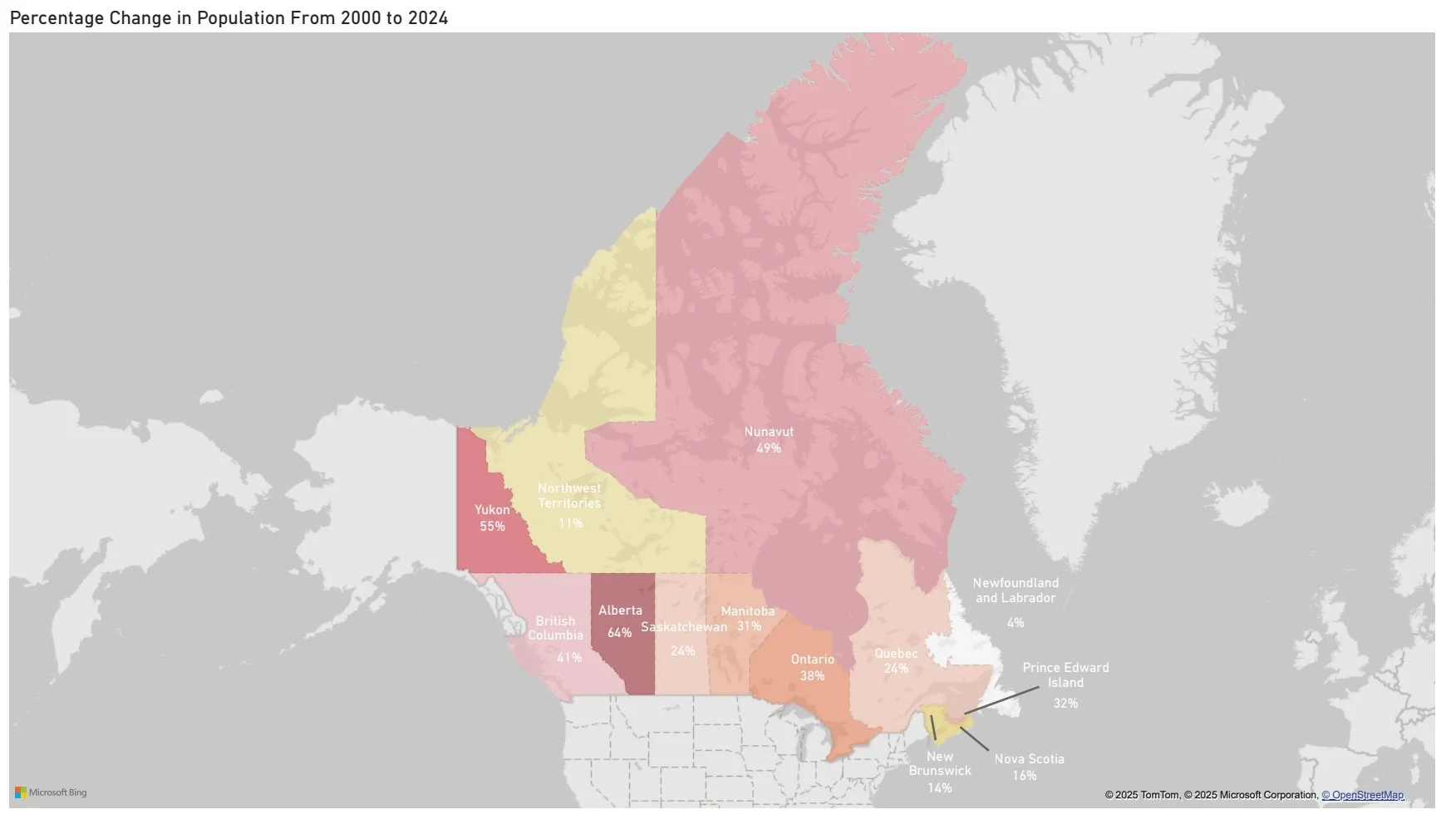
Population Change in a Power BI Filled Map with Heatmap Style Colour
Chart Type: Filled Map
Benefits: Easy to see which regions have the greatest increase in population. More appealing than a traditional bar chart.
Drawbacks: Could be harder to tell the differences between the amount of increase in detail. You have to read the numerical data points more closely to understand the story. Canada is a large country and trying to include the whole country makes the data harder to read. The labels had to be added manually because Power BI doesn’t support this type of labelling in its standard visual.
I like to include the geography of the changes to help tell the story but I don’t think that this visual is very appealing or detailed enough to support a data story. It doesn’t allow for flexibility in filtering.
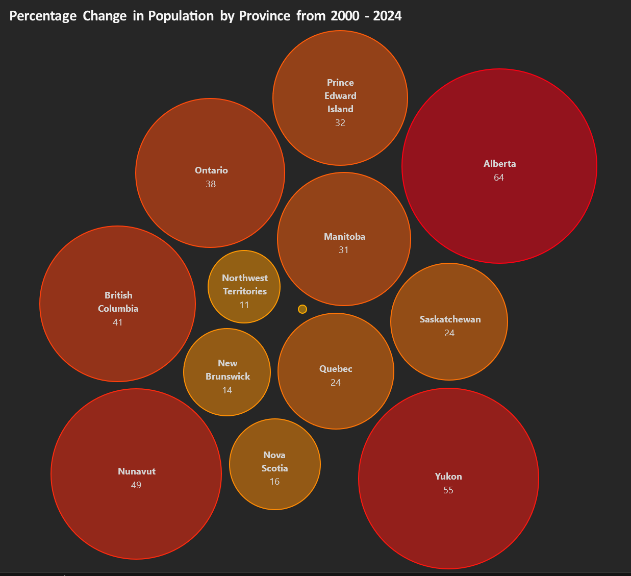
Chart Type: Range Plot
Benefits: Easy to see which regions have the greatest increase in population. Demonstrates the differences between the smallest and largest increases visually. More appealing than a traditional bar chart.
Drawbacks: Lots of data points. Repetitive view, not very visually engaging.
I like this chart because you could highlight just the relevant data points to help tell a story. You could filter and just look at the top five increases or the bottom five increases. It’s a flexible repeatable chart.
Population Change in a Bubble Chart with Heatmap Style Colour
Chart Type: Bubble Chart
Benefits: Easy to see which regions have the greatest increase in population. More appealing than a traditional bar chart. Colouring may not be easy to understand for individuals with colour blindness.
Drawbacks: Eye tends to bounce around the chart without finding a place to rest. May make the chart feel busy to the end user. Text is a bit small to be able to fit the provinces with longer names into the bubbles. Could potentially replace with shortforms to increase readability, but then the end user has to know all of the shortforms but heart to be able to interpret the chart.
I don’t think this is a very effective chart but it is interesting and could catch the eye of an end user.